“Okay, I am a semi-professional race car driver and… an amateur tattoo artist.”
Reese Bobby - Talladega Nights: The Ballad of Ricky Bobby
Alright, “semi-professional race car driver” might be a stretch. I'm still stuck at "paying to race" vs. "getting paid to race" Additionally, I’ve never actually tattooed anyone. So, maybe that quote doesn’t quite cut it.
Instead I’d say that I’m a professional user experience mechanic and a spirited driver of obscure vintage cars. I’ve got 20+ years of passion for great design and empathy for users fuels everything I create. Over the years, I've done laps in the shoes of e-learning students, consumers, market traders, physicians, and more. Alongside wrenches and sockets, my toolbox is packed with design, presentation, collaboration and production-ready frontend code.
In conclusion: Ian writes code for the glory of good UX. Ian likes cars and (most) cars like Ian.
Most things I have done for the past 10 years live behind logins and firewalls of various companies but.. here are some of my doings. Further exploration is available upon request
Outside Inside Outside Racing
I'm the crew chief of the OIO Racing YouTube team, where my buddies and I bring our love for vintage cars (mostly Toyotas) from the track to your variably sized screen. Picture this: classic cars tearing up the track in autocross and rallycross events, with a generous helping grease as we wrench them into racing shape.
As the lead driver of our video content, I juggle writing, shooting, editing, and speaking somewhat intelligently to camera. Through trial, error, and a lot of terrible jokes, I've boosted my skills in everything from motion graphics to sound mastering.
Creative Clothing
A local Kansas City apparel printing company needed a slick homepage, SEO, analyitics and inksoft integration and I was happy to oblige. The project is built in react using nextjs then built and deployed via github actions. Along with my coding skills I got to break out photoshop and figma for some design work on custom banners and even a t-shirt or two.
Daily Health Hub
This was the last project I worked on at Datu. The idea was a program delivery system that would allow physicians and program managers to push nudges to patients with specific illnesses.
I was involved from the conceptual design all the way up through development of the production code. The following screen shots are taken from the responsive prototype.
Physician portal
Datu Health was originally hired by one client to put a new, usable face on their physician and patient portals. The physician portal design evolved over 4 versions into what you see in these screen shots. These are taken from the coded prototype that we used for testing/feedback with physicians.
Patient portal
The other side of the one way mirror in the Datu equation is the patient portal. This serves as a patient's daily reflection of their health and provides access to communicate effectively with providers. Again these are taken from the prototype.
Patient & physician conversations
I managed the experience design and prototype development for this feature. We wanted to create a more familiar conversation interface for people who are used to social media messaging. This design draws inspiration from gmail, basecamp and facebook to present a familiar experience.
The physician side of the conversation design was purposefully kept in sync with the patient's view. This allows for more clarity in any verbal communication about the written messages.
Design library
We on the UX Experience team wanted to create a way for developers to access html and javascript code snippets that, when used in conjunction with the imported styles, would create predictable and consistent UI.
This library served as a jumping off point for any developer creating a new layout. Designers could also pull from the library to create their wireframes. This led to a common language across the two teams and cut down on confusion in translation.
Older work
JP Morgan - iPhone
My first task working at Wall Street On Demand was to design an iPhone app to pitch to JP Morgan. This app would allow their investors to access their portfolios and make adjustments if needed.
NAB
This interactive visualization allows the user to quickly see which sectors gained or lost the most in market cap in a selected day. It can be played back to show where they stood throughout the day.
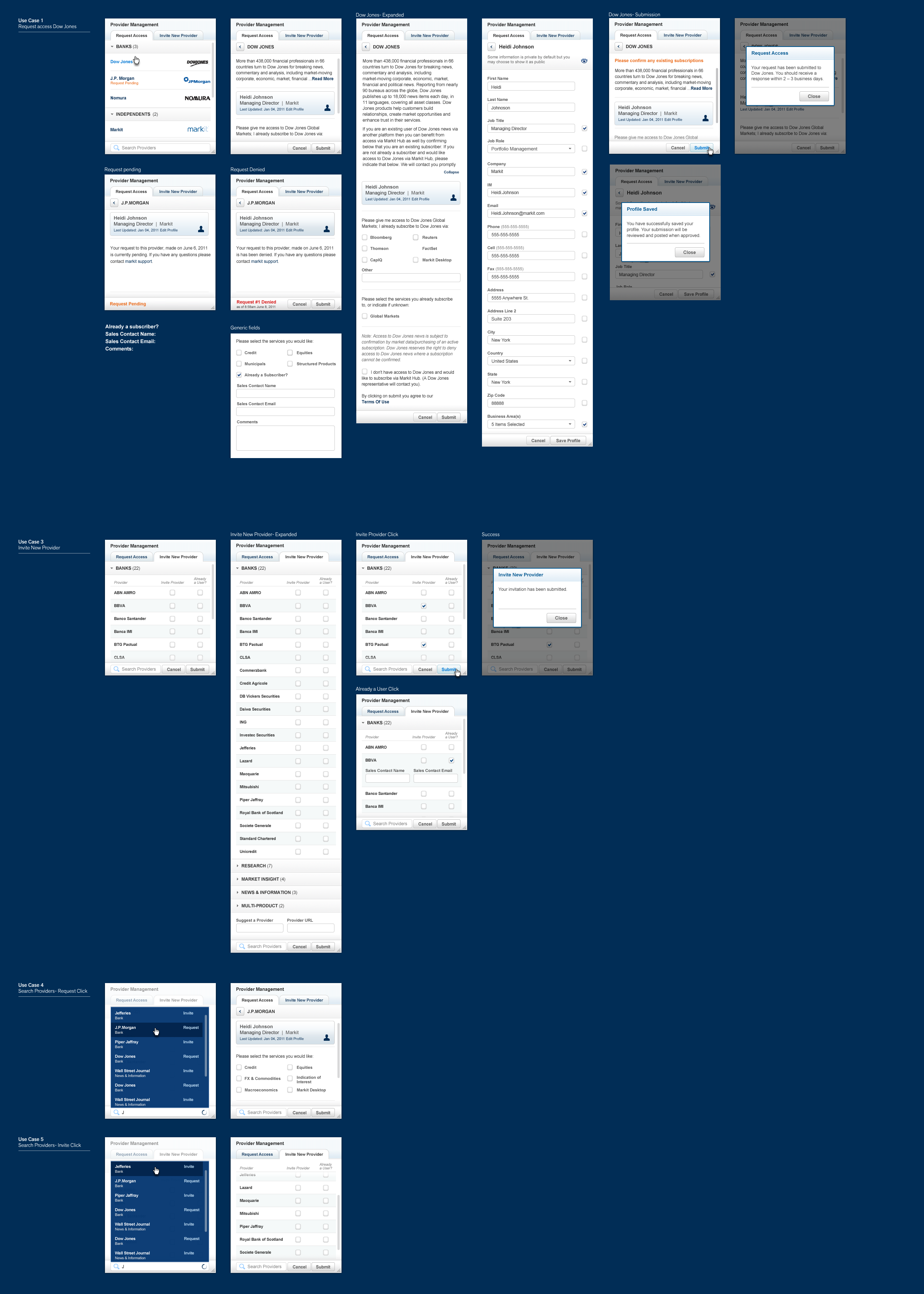
Markit Hub - iPad
I was responsible for gaining a complete understanding of what the current hub.com product provided on the web and translate that to the iPad while taking advantage of the interface to improve upon the experience.
These wireframes were my first step after sketching to start outlining ideas for the product.
I worked with a team of other designers to finalize the functionality and apply the UI to the app
I spent a lot of time working with a developer to create a working example of what we wanted to see on the dashboard of the app. The idea was eventually scrapped for that project but will be used for hub.com
In order to get an idea across to a white label client I had to make a quick video with keynote to explain a tap and hold interaction
Markit Hub - Web
Early exploration - Directory | Clustering
We were trying to throw out really wild ideas against hub.com to see what stuck. These were a couple of my early concepts.
I drew these up to explain my idea for the interactive "hub bar" that would be the key element of the new hub.com design.
People were having a tough time grasping the idea of the hub bar from early wireframes so I decided to put it into code. This helped better explain the interactions and assisted me in finding gaps in the design that the wireframes did not cover.
Click around on the bar at the bottom of the page to discover all of the features. Be sure to try and chat with someone from the directory list. I even wired up how conversations would look.
Hub.com UI - Stream | Briefcase App | Provider App
Some samples of the branded UI created to show the new styles of hub.com and to explain the ideas behind hub "apps"
Protonotes
An internal project to improve our communication tools around prototype feedback and revisions. This system would allow users to select areas of a prototype and create a note about that section. They could also create tags and link the area to another prototype to create a simple interactive click through prototype.